
The following tutorial was written for Qt/PySide6 version 6.5.0.
note
warning
As a Maya plugin developer, I adhere to Maya's and PySide's naming conventions - i.e. I use camelCase instead of PEP8's recommendation which is snake_case.
Let's make our own animated QToggle!
BORING! There are multiple tutorials with the same topic...
Well, I find some of them quite lackluster and some are even beyond a paywall 😮. Additionally, no tutorials fit a text in your QToggle which is a feature I found a great use for - i.e. telling users what the toggle actualy does - On/Off, Enabled/Disabled, True/False, and many more specialized uses.
note
I'll cover more similar topics in the future which are not as prevalently covered on the internet, so stay tuned...
At the end of this tutorial, you should have something like this:
Humble Beginnings
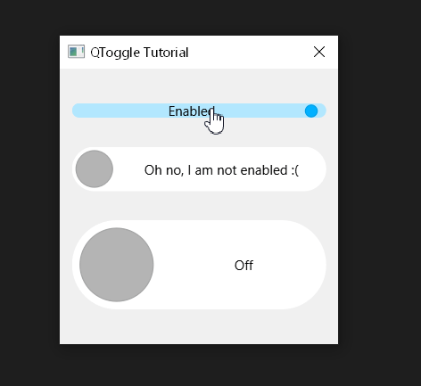
Let's start simple by overriding a regular QCheckBox.
When prototyping new widgets and dialogs, I like to import all possible QtCore, QtWidgets and QtGui classes from PySide6
so that I don't have to handle them. At the end, I usually run my module through my automatic PySide6 imports
generator which is quite crude but does the job (I might cover it in the future).
pyfrom PySide6.QtCore import *
from PySide6.QtWidgets import *
from PySide6.QtGui import *

class QToggle(QCheckBox):
    def __init__(self):
        super().__init__()
Now, let's override its paintEvent so that we have the checkbox's appearance fully under control.
pydef paintEvent(self, _): painter = QPainter(self) # We want our toggle to look nice so let's enable antialiasing. painter.setRenderHint(QPainter.Antialiasing) painter.setPen(Qt.NoPen) # Decide the brush color based on the checkbox's check state. if self.isChecked(): painter.setBrush(Qt.green) else: painter.setBrush(Qt.red) painter.drawRect(self.contentsRect())
note
Because I do not care about the event argument I name it with an underscore.
That's all fine and dandy. But it seems it doesn't properly react to our clicks!
Well, it does, but only in the area where the base QCheckBox implementation actually expects the clicks. The following video will demostrate this clearly:
tip
I am using Microsoft PowerToys for highlighting mouse clicks in the video above.
It also supports previewing .svg files in File Browser and many other things. Quite a handy toolset.
To fix that, we need to override the QAbstractButton.hitButton function which specifies the clickable area of the button.
pydef hitButton(self, pos): return self.contentsRect().contains(pos)
Awesome, now switching between the checked and unchecked states works as expected.
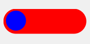
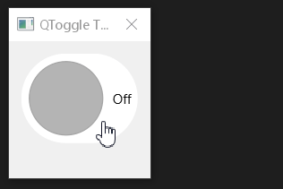
Let's Round Things Up
Ok, now let's improve the visuals a little bit. We are missing the circular handle and rounded borders.
py# Let's draw rounded rectangle instead of the boring regular one. # Because we want the sides to be a semicircle, let's take the radius from the widget's height. contRect = self.contentsRect() radius = contRect.height() / 2 painter.drawRoundedRect(contRect, radius, radius) # Let's find out handle's center position on the x axis. handlePositionMultiplier = 1 if self.isChecked() else 0 travelDistance = contRect.width() - (2 * radius) handlePosX = contRect.x() + radius + travelDistance * handlePositionMultiplier handlePosY = contRect.center().y() + 1 # The + 1 centers our handle on the y axis properly. # We want the handle to fit within the content area. # Let's compute a relative size of the handle. For example 0.8 sounds like a nice value. # For simplicity sake, I define the constant here, later, we will put it in the module's global scope. _HANDLE_REL_SIZE = 0.8 handleRadius = _HANDLE_REL_SIZE * radius # Now let's draw the handle. painter.setPen(Qt.NoPen) painter.setBrush(Qt.blue) painter.drawEllipse(QPointF(handlePosX, handlePosY), handleRadius, handleRadius)
Now we should have something like this:
warning
I am cheating a little bit by setting the toggle's fixed height to 40px after creating it for the purpose of the preview videos. Later on, we'll handle size hints properly.
Coloring Time 🎨
Everything is looking pretty - let's give users of our new widget more control (but not too much, they'll get greedy). Let's give them an option to set checked and unchecked color of the toggle. The handle should IMHO complement the palette used by the toggle, so instead of adding an option to set its color as well, let's use the same color for both the body and handle with slight value adjustments.
tip
Qt's QColor offers two very nice functions so that we do not have to exert ourselves coming up with our custom solutions how to adjust values - i.e. the two steps of converting to HSV and adjusting value... duh... 😉
The functions are QColor.lighter(factor) and QColor.darker(factor).
Additionally, you may have noticed that we are using QBrushes in the paintEvent. Let's construct them with the toggle or when setting the colors instead of during each paintEvent. These two setters should do the trick:
pydef setCheckedColor(self, color): self._checkedHandleBrush = QBrush(color) self._checkedBodyBrush = QBrush(color.lighter(170)) def setUncheckedColor(self, color): self._uncheckedHandleBrush = QBrush(color) self._uncheckedBodyBrush = QBrush(color.lighter(170))
And now utilize them in the constructor. I set some default checked and unchecked colors if the user is too lazy to specify his own.
pydef __init__(self, checkedColor=QColor(60, 200, 180), uncheckedColor=QColor(200, 100, 120)): super().__init__() self.setCheckedColor(checkedColor) self.setUncheckedColor(uncheckedColor)
I leave it up to you to adjust your paintEvent to use the newly created member brushes. If you are stumped, I'll provide whole source code at the end of the article so you don't have to suffer.
Now this looks more pleasing to the eye:
Animation
Now for the fun part. Let's animate our toggle!
We need a member variable that can be animated using Qt. For this purpose we can use Qt's Property system. Specifically QProperty in conjuction with QPropertyAnimation.
You may recall seeing a handlePositionMultiplier value in our paintEvent() above.
This is actually the value we want to animate.
This value will range from [0, 1] and basically specify how much the toggle's handle is to the left (unchecked == 0) or to the right (checked == 1).
Let's add it to the constructor and let's add getter and setter as specified by QProperty documentation:
pyclass QToggle(QCheckBox):
    def __init__(self, checkedColor=QColor(60, 200, 180), uncheckedColor=QColor(200, 100, 120)):
        super().__init__()

        self.setCheckedColor(checkedColor)
        self.setUncheckedColor(uncheckedColor)


        self._handlePositionMultiplier = 0


    @Property(float)
    def handlePositionMultiplier(self):
        return self._handlePositionMultiplier


    @handlePositionMultiplier.setter
    def handlePositionMultiplier(self, handlePositionMultiplier):
        self._handlePositionMultiplier = handlePositionMultiplier
        self.update() # Update and repaint the widget.
Notice the self.update() line in the setter after the value vas set. This is because we need to repaint the widget.
Why update() and not repaint()?
Let's look in the docs about update():
This function does not cause an immediate repaint; instead it schedules a paint event for processing when Qt returns to the main event loop. This permits Qt to optimize for more speed and less flicker than a call to repaint() does. Calling update() several times normally results in just one paintEvent() call.
Don't forget to update your paintEvent so that self._handlePositionMultiplier is used instead of the local handlePositionMultiplier
we've created in the chapter before.
Now for the animation itself, it's pretty simple:
py# The constructor expects a sequence of bytes - i.e. a byte array. self._animation = QPropertyAnimation(self, b"handlePositionMultiplier") # See the QEasingCurve documentation on how each easing curve looks. self._animation.setEasingCurve(QEasingCurve.InOutCubic) # Duration of the animation in milliseconds. # We define it somewhere in the module as follows: # _ANIMATION_DURATION = 200 -> i.e. 0.2 seconds long. self._animation.setDuration(_ANIMATION_DURATION)
We've created it, but we haven't used it anywhere yet.
To run it, we will use its start() method, however, where?
Well, when the user toggles the toggle... ahem - on its stateChanged!
We expand the constructor as follows:
pyclass QToggle(QCheckBox):
    def __init__(self, checkedColor=QColor(60, 200, 180), uncheckedColor=QColor(200, 100, 120)):
        super().__init__()

        self.setCheckedColor(checkedColor)
        self.setUncheckedColor(uncheckedColor)

        self._handlePositionMultiplier = 0

        self._animation = QPropertyAnimation(self, b"handlePositionMultiplier")
        self._animation.setEasingCurve(QEasingCurve.InOutCubic)
        self._animation.setDuration(_ANIMATION_DURATION)

        self.stateChanged.connect(self._onStateChanged)
Now we need to implement the _onStateChanged callback:
pydef _onStateChanged(self, state): # Let's stop the animation first if it is already running! self._animation.stop() # We explicitly cast state to bool - technically, no casting is needed # here and this approach may be considered more Pythonic, however checkBox # states are 0 if unchecked, 1 if partially checked and 2 if checked fully. # I always like to guide any other programmers that come upon my code with # indicators of what is happening so they don't shoot themselves in the foot. if bool(state): # If bool(state) is True, the checkbox is checked. # We want the handle to be on the right side, therefore # the animation should finish with the handlePositionMultiplier # property being equal to 1. self._animation.setEndValue(1) else: # Same logic as above, just inversed. self._animation.setEndValue(0) # Now we can finally start the animation. self._animation.start()
Let's see it in action with animation time set to 200ms:
Adding Text
We want the toggle to contain text which describes its checked and unchecked states.
For this, we introduce two variables - checkedText and uncheckedText. We can add them to the constructor:
pydef __init__(self, checkedText="", uncheckedText="", checkedColor=QColor(0, 176, 255), uncheckedColor=QColor(180, 180, 180)): super().__init__() self._checkedText = checkedText self._uncheckedText = uncheckedText # Etc...
In our paintEvent() - we need to do a lot of work to make our text happen.
First, I switch between the checked and unchecked text values based on the _handlePositionMultiplier, however,
you may opt in to just switch it based on the check state. I like it when it switches in the middle of the animation.
pyif self._handlePositionMultiplier > 0.5: currentText = self._checkedText else: currentText = self._uncheckedText
Now for the actual text drawing:
First, let's add the diameter to our arsenal to avoid writing radius * 2 in multiple places.
pycontRect = self.contentsRect() diameter = contRect.height() radius = diameter / 2
And now for the text itself:
py# Draw the text. painter.save() # We want to offset the text by the diameter - how much? # Well - inversely to the amount of handle travel. textRectX = diameter * (1.0 - self._handlePositionMultiplier) # The text rectangle width is just the whole content rect width without the diameter. textRectWidth = contRect.width() - diameter textRect = QRect(textRectX, 0, textRectWidth, contRect.height()) painter.setBrush(Qt.NoBrush) painter.setPen(QPen(QColor.fromRgbF(0, 0, 0, textOpacity))) painter.drawText(textRect, Qt.AlignCenter, currentText) painter.restore()
Now if you are feeling fancy, you may also want to fade the text through the handle during the animation. This can be done very simply by doing some basic math. In short, if the handle's position multiplier is 0.5 - i.e. the handle is in the middle, we want the text opacity to be 0, and the closer the handle gets to edges (handle's position multiplier approaches 0 or 1), the opacity should become higher until it is 1 on either side.
py# Trick for fading the text through the handle during transition. textOpacity = abs(0.5 - self._handlePositionMultiplier) * 2
Behold the fading text with animation length set to 1 second!
Awesome, now we have text in the toggle. But WAIT! It looks horrible when resized or scaled 😞 ...
Let's have a looksie - I've created 3 toggles, first has its preferred/default size, second has height set to 40px and
the third has height set to 80px.
We can scale the dialog/layout they are in and they will collapse onto themselves. Additionally, the tiny text looks bad in the big toggle we've created.
note
Fixing this was quite an involved process. I've landed on the following solution but if you have any ideas how to improve it, let me know.
Let's start by defining two constants - the preferred height of the widget - some height in pixels that makes sense for the toggle to have. I've selected 20px, but you can choose your own (or even make it into a parameter). Additionally, I am going to add some side padding to the text. I.e. padding to where the text meets the side of the toggle.
py_PREFERRED_HEIGHT = 20
_TEXT_SIDE_PADDING = 4
We want the toggle to be at least as wide as the text + the handle + any additional margins/paddings within it.
For that reason, let's override the sizeHint() method:
pydef sizeHint(self): # Let's find out the maximum width of the text. # We have to check both the checked and unchecked text and compute their width. maxTextWidth = float("-inf") for text in [self._checkedText, self._uncheckedText]: # Let's use fontMetrics to do the hard calculations for us. textSize = self.fontMetrics().size(Qt.TextSingleLine, text) maxTextWidth = max(maxTextWidth, textSize.width()) # Let's determine the preferred height. # We have to take the minimum height (which can be set using setMinimumHeight() or setFixedHeight()). # We take the bigger value of the minimum height and our own defined _PREFERRED_HEIGHT. preferredHeight = max(self.minimumHeight(), _PREFERRED_HEIGHT) # The resulting preferred width is composed of the following: # 1. the preferredHeight (why height???) - well, the preferredHeight is going to be equal # to the diameter of the handle, so it makes sense # that we want to accomodate the handle's width here as well. # # 2. the maximum text width - We want both the checked and unchecked text to fit horizontally. # - I multiply it using a magic number (1.2) so that the text has # some space to breathe. # -> Later we will add text scaling, so if the text is too big, it might overflow # the rounded edges of the toggle, for that reason we add this magic padding. # # 3. Some additional _TEXT_SIDE_PADDING we will integrate in the paintEvent() soon. return QSize(preferredHeight + maxTextWidth * 1.2 + _TEXT_SIDE_PADDING, preferredHeight)
tip
Did you know that QWidget's setFixedXXX() functions (where XXX is either Size, Width or Height) are just helpers that call both setMinimumXXX() and setMaximumXXX() both at once?
In the paintEvent(), let's add our newly defined _TEXT_SIDE_PADDING.
We want it to be applied on the side of the text that is touching the toggle's edge.
py# Draw the text. painter.save() textPosMultiplier = (1.0 - self._handlePositionMultiplier) textRectX = diameter * textPosMultiplier + _TEXT_SIDE_PADDING * self._handlePositionMultiplier textRectWidth = contRect.width() - diameter - _TEXT_SIDE_PADDING textRect = QRect(textRectX, 0, textRectWidth, contRect.height()) # Trick for fading the text through the handle during transition. textOpacity = abs(0.5 - self._handlePositionMultiplier) * 2
Et voila!
It won't let us make the toggle smaller than the text + its handle. But we still have a size problem on our hands.
For this, I have a simple solution (which works with our sizeHint() beautifully). Let's override resizeEvent() - an event
which is called anytime the toggle is resized (duh).
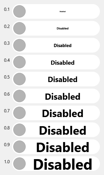
In it, let's adjust the font's pixel size with relation to the height of the toggle.
For demonstration purposes, let's use 0.5, but you can parametrize it if you wish 😉.
You can also set its font and adjust it as you wish, I've set it to bold. Everything should still be
handled correctly because we use fontMetrics() on the current font in our sizeHint().
pydef resizeEvent(self, event): font = self.font() font.setBold(True) font.setPixelSize(event.size().height() * 0.5) self.setFont(font)
I've created an overview of toggles with their relative sizes set to 0.1 up to 1.0. You choose what's best for you.
Finishing Touches
Cursor
It is nice to let our users know that something special is going to happen when they click our toggle. We can achieve that by changing the cursor when the toggle is being hovered - just add this line in the constructor:
pyself.setCursor(Qt.PointingHandCursor)
Make text() Usable
Because we have overriden a QCheckBox with no text. Let's make text() useful once again so that any
time user queries text on our toggle, they'll get the text that is being currently displayed.
Simplest way to achieve this is to create our own helper function _updateText() which will be called
at the end of constructor and any time the toggle's checked state has changed.
pydef _updateText(self): self.setText(self._checkedText if self.isChecked() else self._uncheckedText)
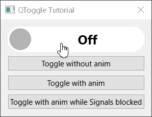
Programmatically Changing States
What if we want to set the checked state programmatically, will everything work as expected? That depends, do we want to see the animation?
Toggle Without Animation
Let's implement a helper function which will allow us to set the checked state without actually seeing the animation.
pydef setCheckedNoAnim(self, checked): # Let's be cheeky, set the animation's duration to 0ms - hence no animation. self._animation.setDuration(0) self.setChecked(checked) # Reset animation duration back to original value. self._animation.setDuration(_ANIMATION_DURATION)
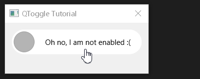
Signals Blocked Edge Case
error
Beware - this is actually a bug in our toggle!
Thanks to using the toggle in practice in SCS Software's pipeline, I've also encountered another issue/edge case with this implementation of the toggle.
If we block signals on our toggle and programmatically set its checked state using the native setChecked() function, we'll get into
a very nasty situation. The color of the toggle will be updated, but not its handle or text.
That is because our QPropertyAnimation is not being properly updated.
This is the code that will get us in trouble:
pydef _toggleWithAnimWhileSignalsBlocked(self): self._toggle.blockSignals(True) self._toggle.setChecked(not self._toggle.isChecked()) self._toggle.blockSignals(False)
And this is how it looks like in action:
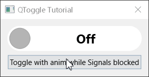
To alleviate this issue, let's override the setChecked() function and ensure that the toggle immediatelly reaches the final state.
pydef setChecked(self, checked): super().setChecked(checked) # Ensure we are in the finished animation state if there are signals blocked from the outside! if self.signalsBlocked(): self._handlePositionMultiplier = 1 if checked else 0 # Ensure the toggle is updated visually even though it seems this is not necessary. self.update() self._updateText()
Now everything seems to be in order. FINALLY!
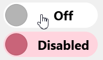
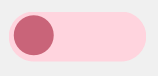
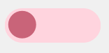
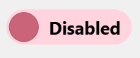
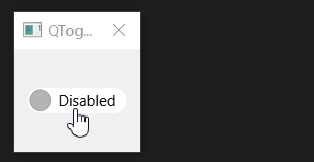
Disabled State
Lastly, what if we disable our toggle? It looks the same as if it was enabled. That is not ideal to say the least.
Let's fix that by adjusting its appearance in the paintEvent().
You can do your own disabled state handling, this is how I do it.
First, let's make our text lose some opacity if the toggle is disabled.
py# Draw the text. painter.save() textPosMultiplier = (1.0 - self._handlePositionMultiplier) textRectX = diameter * textPosMultiplier + _TEXT_SIDE_PADDING * self._handlePositionMultiplier textRectWidth = contRect.width() - diameter - _TEXT_SIDE_PADDING textRect = QRect(textRectX, 0, textRectWidth, contRect.height()) if self.isEnabled(): # Trick for fading the text through the handle during transition. textOpacity = abs(0.5 - self._handlePositionMultiplier) * 2 else: # Override text opacity for disabled toggle. textOpacity = 0.5 painter.setBrush(Qt.NoBrush) painter.setPen(QPen(QColor.fromRgbF(0, 0, 0, textOpacity))) painter.drawText(textRect, Qt.AlignCenter, currentText) painter.restore()
Also let's change the handle's appearance so it feels like it is not clickable/draggable what have you doing basically the same as with the text, decreasing its opacity (only the handle's body in this case).
py# Adjust the handle drawing brush if the toggle is not enabled. if not self.isEnabled(): newColor = painter.brush().color() newColor.setAlphaF(0.5) painter.setBrush(QBrush(newColor)) # Draw the handle. travelDistance = contRect.width() - diameter handlePosX = contRect.x() + radius + travelDistance * self._handlePositionMultiplier handleRadius = _HANDLE_REL_SIZE * radius painter.drawEllipse(QPointF(handlePosX, contRect.center().y() + 1), handleRadius, handleRadius)
Final Implementation
And that's it. We've finally created a universal animated toggle which takes a lot of stuff into consideration.
Thank you for going on this journey with me! Here is the final code for the toggle:
pyfrom PySide6.QtCore import Property, Qt, QSize, QPropertyAnimation, QEasingCurve, QRect, QPointF
from PySide6.QtWidgets import QCheckBox
from PySide6.QtGui import QColor, QPainter, QPen, QBrush


_ANIMATION_DURATION = 200 # Time in ms.
_HANDLE_REL_SIZE = 0.82
_PREFERRED_HEIGHT = 20
_TEXT_SIDE_PADDING = 4


class QToggle(QCheckBox):
    def __init__(self, checkedText="", uncheckedText="", checkedColor=QColor(0, 176, 255), uncheckedColor=QColor(180, 180, 180), fontHeightRatio=0.5, parent=None):
        super().__init__(parent=parent)
        assert(0 < fontHeightRatio <= 1)

        self._checkedText = checkedText
        self._uncheckedText = uncheckedText
        self._fontHeightRatio = fontHeightRatio

        self.setCheckedColor(checkedColor)
        self.setUncheckedColor(uncheckedColor)

        self._handlePositionMultiplier = 0

        self._animation = QPropertyAnimation(self, b"handlePositionMultiplier")
        self._animation.setEasingCurve(QEasingCurve.InOutCubic)
        self._animation.setDuration(_ANIMATION_DURATION)

        self.stateChanged.connect(self._onStateChanged)
        self.setCursor(Qt.PointingHandCursor)
        self._updateText()


    def _updateText(self):
        self.setText(self._checkedText if self.isChecked() else self._uncheckedText)


    @Property(float)
    def handlePositionMultiplier(self):
        return self._handlePositionMultiplier


    @handlePositionMultiplier.setter
    def handlePositionMultiplier(self, handlePositionMultiplier):
        self._handlePositionMultiplier = handlePositionMultiplier
        self.update()


    def resizeEvent(self, event):
        font = self.font()
        font.setBold(True)
        font.setPixelSize(event.size().height() * self._fontHeightRatio)
        self.setFont(font)


    def sizeHint(self):
        maxTextWidth = float("-inf")
        for text in [self._checkedText, self._uncheckedText]:
            textSize = self.fontMetrics().size(Qt.TextSingleLine, text)
            maxTextWidth = max(maxTextWidth, textSize.width())

        # We use _PREFERRED_HEIGHT to prevent users from shooting themselves in the foot (visually).
        preferredHeight = max(self.minimumHeight(), _PREFERRED_HEIGHT)

        # The 1.2 is a magic number creating some padding for the text so
        # that big letters do not overflow the rounded corners.
        return QSize(preferredHeight + maxTextWidth * 1.2 + _TEXT_SIDE_PADDING, preferredHeight)


    def hitButton(self, pos):
        """ Define the clickable area of the checkbox.
        """
        return self.contentsRect().contains(pos)


    def _onStateChanged(self, state):
        self._animation.stop()
        if bool(state):
            self._animation.setEndValue(1)
        else:
            self._animation.setEndValue(0)
        self._animation.start()


    def paintEvent(self, _):
        painter = QPainter(self)
        painter.save()
        painter.setRenderHint(QPainter.Antialiasing)

        contRect = self.contentsRect()
        diameter = contRect.height()
        radius = diameter / 2

        # Determine current text based on handle position
        # during the animation - switch it right in the middle.
        if self._handlePositionMultiplier > 0.5:
            currentText = self._checkedText
        else:
            currentText = self._uncheckedText

        # Determine used brushes based on check state.
        if self.isChecked():
            bodyBrush = self._checkedBodyBrush
            handleBrush = self._checkedHandleBrush
        else:
            bodyBrush = self._uncheckedBodyBrush
            handleBrush = self._uncheckedHandleBrush

        # Draw the toggle's body.
        painter.setPen(Qt.NoPen)
        painter.setBrush(bodyBrush)
        painter.drawRoundedRect(contRect, radius, radius)
        painter.setPen(QPen(handleBrush.color().darker(110)))
        painter.setBrush(handleBrush)

        # Draw the text.
        painter.save()
        textPosMultiplier = (1.0 - self._handlePositionMultiplier)
        textRectX = diameter * textPosMultiplier + _TEXT_SIDE_PADDING * self._handlePositionMultiplier
        textRectWidth = contRect.width() - diameter - _TEXT_SIDE_PADDING
        textRect = QRect(textRectX, 0, textRectWidth, contRect.height())
        if self.isEnabled():
            # Trick for fading the text through the handle during transition.
            textOpacity = abs(0.5 - self._handlePositionMultiplier) * 2
        else:
            # Override text opacity for disabled toggle.
            textOpacity = 0.5
        painter.setBrush(Qt.NoBrush)
        painter.setPen(QPen(QColor.fromRgbF(0, 0, 0, textOpacity)))
        painter.drawText(textRect, Qt.AlignCenter, currentText)
        painter.restore()

        # Adjust the handle drawing brush if the toggle is not enabled.
        if not self.isEnabled():
            newColor = painter.brush().color()
            newColor.setAlphaF(0.5)
            painter.setBrush(QBrush(newColor))

        # Draw the handle.
        travelDistance = contRect.width() - diameter
        handlePosX = contRect.x() + radius + travelDistance * self._handlePositionMultiplier
        handleRadius = _HANDLE_REL_SIZE * radius
        painter.drawEllipse(QPointF(handlePosX, contRect.center().y() + 1), handleRadius, handleRadius)

        painter.restore()


    def setChecked(self, checked):
        super().setChecked(checked)
        # Ensure we are in the finished animation state if there are signals blocked from the outside!
        if self.signalsBlocked():
            self._handlePositionMultiplier = 1 if checked else 0
            # Ensure the toggle is updated visually even though it seems this is not necessary.
            self.update()
        self._updateText()


    def setCheckedNoAnim(self, checked):
        self._animation.setDuration(0)
        self.setChecked(checked)
        self._animation.setDuration(_ANIMATION_DURATION)


    def setCheckedColor(self, color):
        self._checkedHandleBrush = QBrush(color)
        self._checkedBodyBrush = QBrush(color.lighter(170))


    def setUncheckedColor(self, color):
        self._uncheckedHandleBrush = QBrush(color)
        self._uncheckedBodyBrush = QBrush(color.lighter(170))